
Empathy Mapping
01
02
03
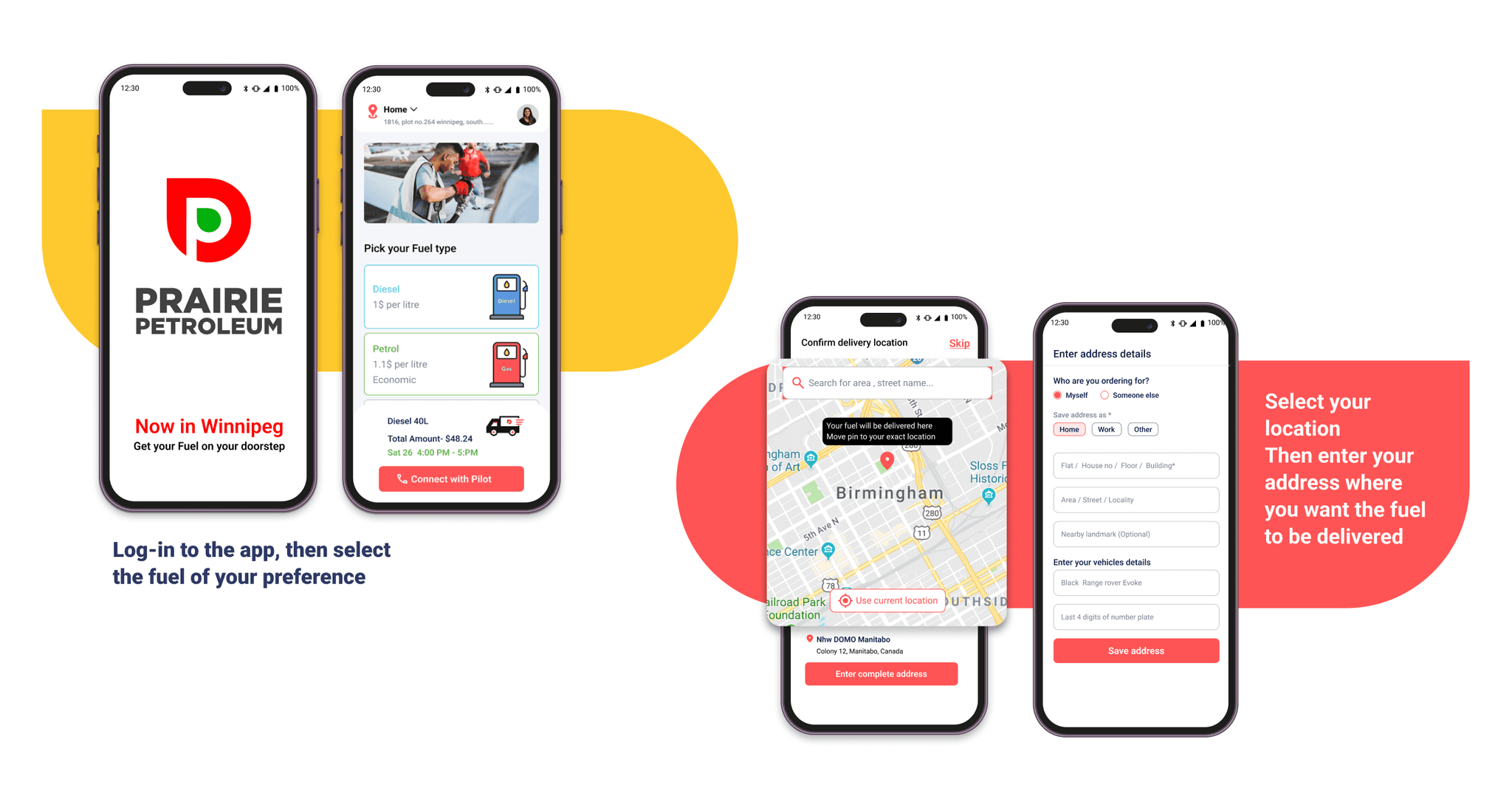
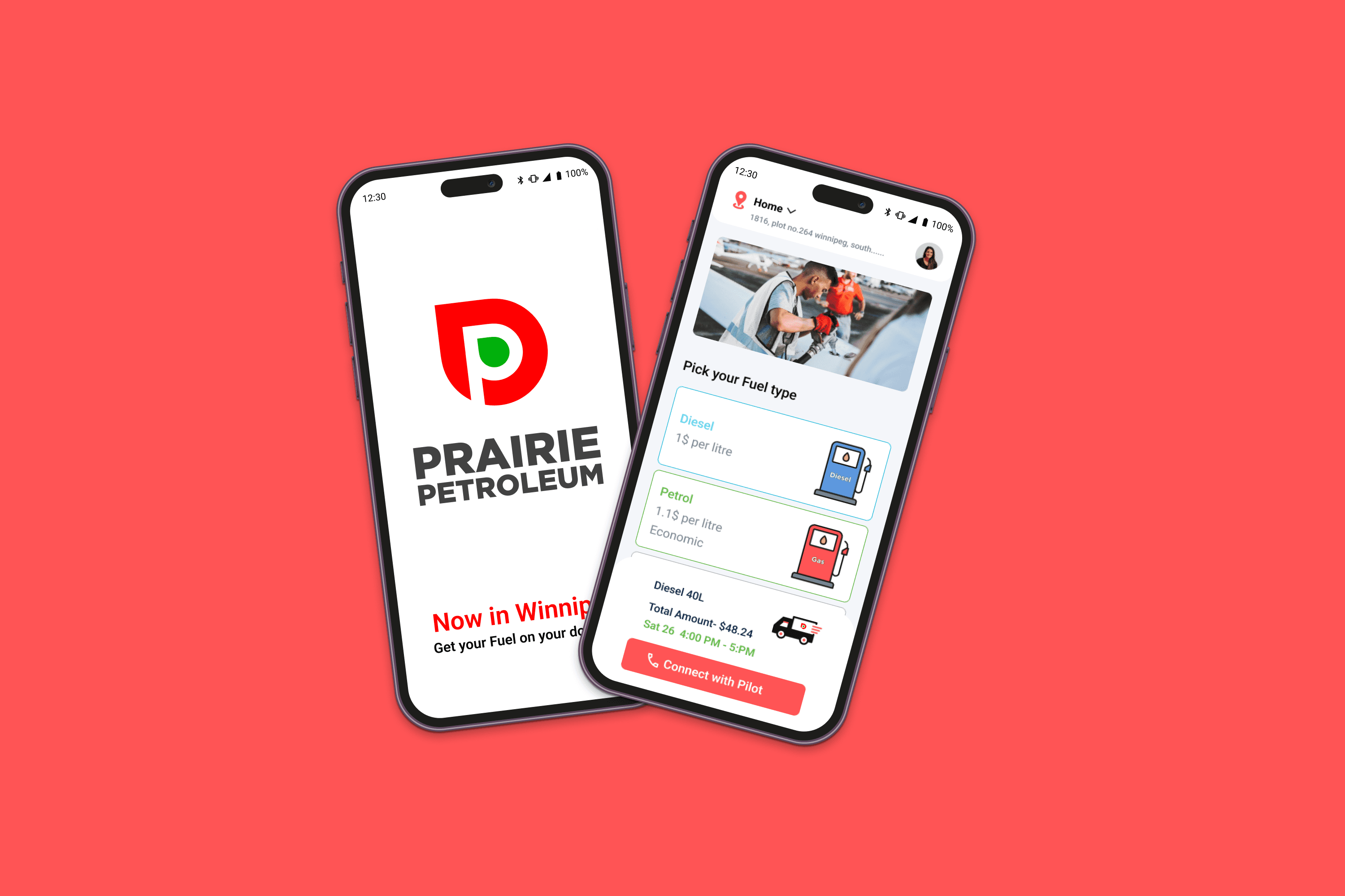
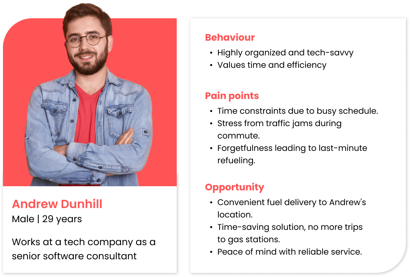
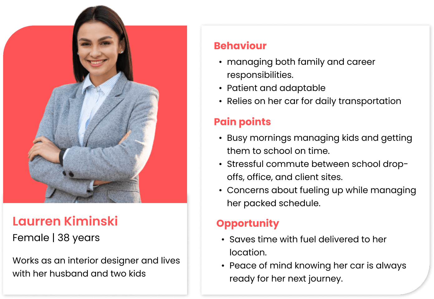
With this approach in mind, we started brainstorming a concrete solution for the product. We focused on our three key users—Vehicle Owner, Fuel Delivery Agent, and Admin. We then put ourselves in their shoes and carefully analysed how each group would interact with the app, paying close attention to their roles and actions. This helped us design the user flows.
Stakeholder Analysis:
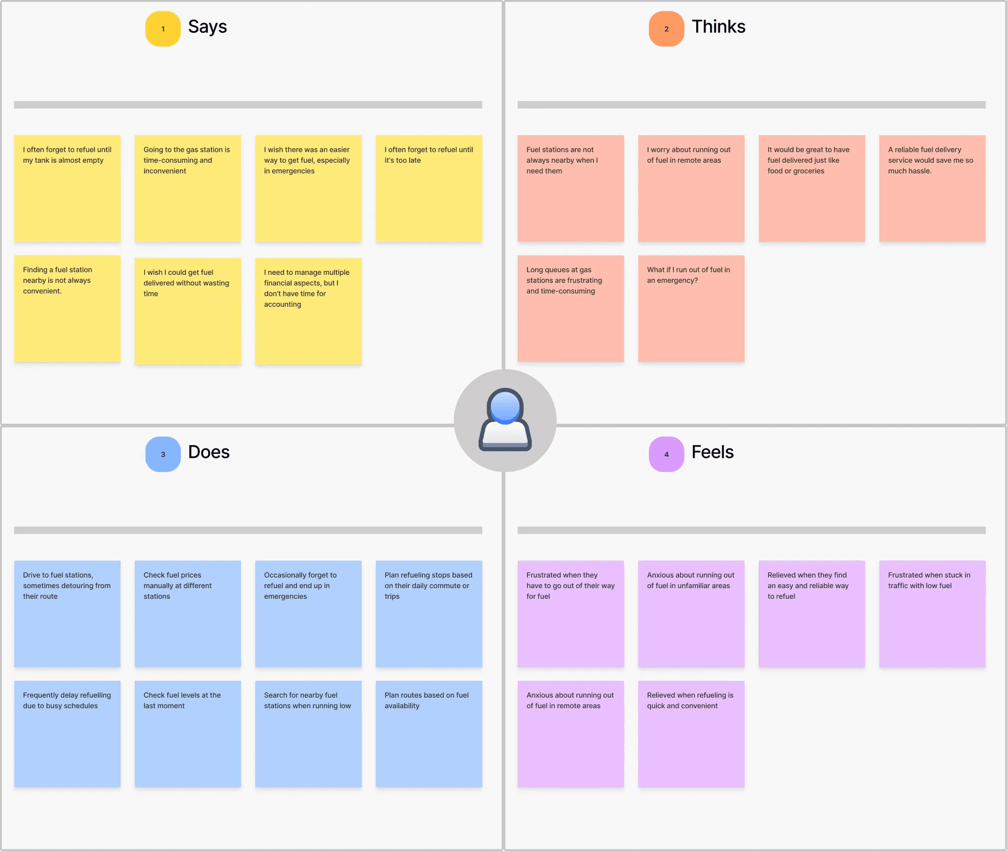
We started by mapping out each stakeholder's role and responsibilities.
This involved identifying their specific goals, pain points, and interactions within the app ecosystem.
For instance, we considered:
What does a customer need to easily order fuel?
What information does a delivery partner require to efficiently complete a delivery?
How does a fuel provider manage inventory and delivery requests?
How does the admin manage the whole operation?
User Flow Development:
Based on our stakeholder analysis, we constructed detailed user flows for each critical task within the app.
These flows visually represented the steps a user would take to accomplish a specific action, such as placing an order, accepting a delivery, or managing inventory.
We paid particular attention to creating logical and efficient pathways, minimizing unnecessary steps and potential points of friction.
`

Wireframes
To create effective wireframes and user flows for the Prairie Petroleum fuel delivery app, we adopted a user-centered and stakeholder-inclusive approach. Our process began with a deep dive into understanding the needs and perspectives of all involved parties: customers, delivery partners, fuel providers, and administrators.
With the user flows established, we moved on to creating low-fidelity wireframes.
These wireframes served as skeletal representations of the app's interface, focusing on layout, information hierarchy, and key interactive elements.
We designed separate wireframes for both the customer and delivery partner interfaces, ensuring that each catered to their unique requirements.
We iterated on these wireframes, refining them based on internal feedback and usability considerations.
We focused on clarity and simplicity, ensuring that the interface was intuitive and easy to navigate.